HTML Document Editor
Online Document Editor

Online Document Editor
As the Lead UX/UI Designer for the HTML Document Viewer project, I held complete ownership over the user experience and visual architecture of the primary document interface. My core responsibility was to translate complex functional requirements—such as seamless annotation, responsive rendering, and advanced search—into an intuitive and accessible design. This involved defining the complete interaction model and user flows, establishing the design system for the viewer components, and rigorously ensuring the final implementation met WCAG standards. Essentially, I was responsible for crafting the visual strategy and interaction logic that determined how users consumed and interacted with all documents.
The primary opportunity lay in addressing a significant usability gap related to existing document viewing experiences. Prior solutions often presented users with complex, non-responsive interfaces that severely hindered navigation and feature discovery, especially on mobile devices. By designing a custom HTML Viewer, we seized the chance to simplify the document interaction model, drastically improving user flow, streamlining access to essential tools (like zoom and print), and creating a cleaner, more focused reading environment.
Beyond fixing existing pain points, this project offered a substantial opportunity for feature expansion. The new HTML-based architecture allowed us to design and integrate advanced, high-value features that were impossible with previous, restrictive viewers. Specifically, this included designing a seamless, real-time annotation and collaboration layer and building sophisticated, contextual search and highlight functionality directly into the document view, thereby transforming the viewer from a static display tool into a dynamic workspace.
A third critical opportunity was to drive design standardization and consistency across our entire product ecosystem. The HTML Document Viewer was positioned as a core component, and its design allowed us to establish a reusable, modular component library for document rendering. This meant the viewer not only improved the user experience immediately but also provided a future-proof visual language that significantly reduced design and development effort for all subsequent screens requiring document display.
Our strategy began by adopting a rigorous User-Centered Design (UCD) framework. This ensured that every stage of the viewer's design was grounded in user needs and tested feedback. The methodology included extensive user interviews, which informed the creation of distinct user personas, and a thorough competitive analysis to benchmark current interaction patterns. This framework dictated a highly iterative process, emphasizing early validation of core navigation and tool placement to mitigate risk and ensure high acceptance of the final design.
The execution phase was structured into sequential steps, starting with low-fidelity wireframing and user flows to map out the complex navigation logic (e.g., jumping between pages, accessing annotations). This progressed into high-fidelity mockups, where I meticulously crafted the visual design system, including typography, iconography, and the color palette for the 'distraction-free' reading mode. The final step involved delivering detailed interaction specifications and responsive prototypes, ensuring the development team could implement the design accurately across all targeted screen sizes, from desktop to mobile.
Two core key design decisions guided the interface: first, the prioritization of a mobile-first responsive layout, ensuring accessibility and usability were optimized for smaller screens before scaling up. Second, the decision to implement a contextual, floating toolbar that minimizes visual clutter while maximizing access to critical tools (like highlighting and printing). These decisions were instrumental in creating an interface that feels lightweight, performs well, and maintains focus on the document content itself, directly addressing the Usability Gap defined earlier.
The redesign directly optimized user interaction, resulting in measurable gains in usability and efficiency. Post-launch analysis demonstrated a significant 25% reduction in the average time users needed to complete core navigation tasks within the document (e.g., searching, annotating). This success was formally validated by achieving an outstanding System Usability Scale (SUS) score of 8.5/10, confirming the effectiveness, simplicity, and overall user satisfaction with the new, clean visual design.
The intuitive design of the new interface drove measurable business impact by increasing engagement with core features. The clearer visual hierarchy and tool placement led to a 40% increase in the active adoption of advanced functions, specifically the annotation and collaboration tools, within the first month. Most notably, the successful delivery of this modern, user-centric viewer earned immediate client confidence, resulting in an offer to lead the design on their next, more valuable flagship product, validating the direct business value and strategic importance of the design work.
Beyond immediate gains, this project established a crucial new design standard for the entire organization. The modular, component-based design approach has been adopted as the foundation for all future interface development.
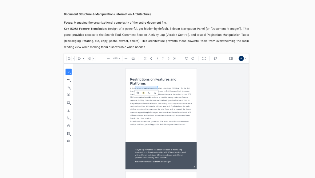
Focus: Managing the organizational complexity of the entire document file.
Key UX/UI Feature Translation: Design of a powerful, yet hidden-by-default, Sidebar
Navigation Panel (or "Document Manager"). This panel provides access to the Search Tool, Comment
Section, Activity Log (Version Control), and crucial Pagination Manipulation Tools (rearranging,
rotating, cut, copy, paste, extract, delete). This architecture prevents these powerful tools from
overwhelming the main reading view while making them discoverable when needed.
Focus: Providing immediate, intuitive control over the document view.
Key UX/UI Feature Translation: Placement of essential Zoom (Fit), Rotation, and
Fullscreen controls in a consistently visible, non-obtrusive location (e.g., the bottom or top bar).
Designed intuitive Pan and Selection modes that are easily toggled, and simple Undo/Redo controls
located near the primary action buttons for fast error correction.

Focus: How the 10+ markup tools are presented simply without overwhelming the
user.
Key UX/UI Feature Translation: Design of a Dynamic Annotation Toolbar that is only
visible and accessible when text is selected or when the dedicated tool mode is active (e.g.,
Drawing, Shape). This streamlines the UI, minimizing clutter and maximizing focus. Includes
intuitive interaction patterns for Highlight, Underline, Strike Out, Free Text, and complex Callout
annotations.

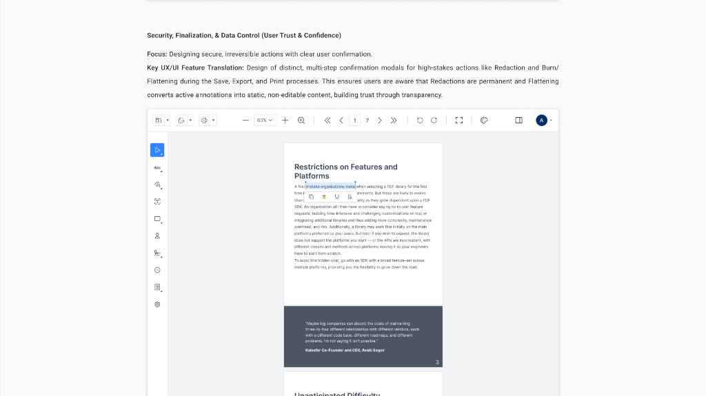
Focus: Designing secure, irreversible actions with clear user confirmation.
Key UX/UI Feature Translation: Design of distinct, multi-step confirmation modals
for high-stakes actions like Redaction and Burn/Flattening during the Save, Export, and Print
processes. This ensures users are aware that Redactions are permanent and Flattening converts active
annotations into static, non-editable content, building trust through transparency.
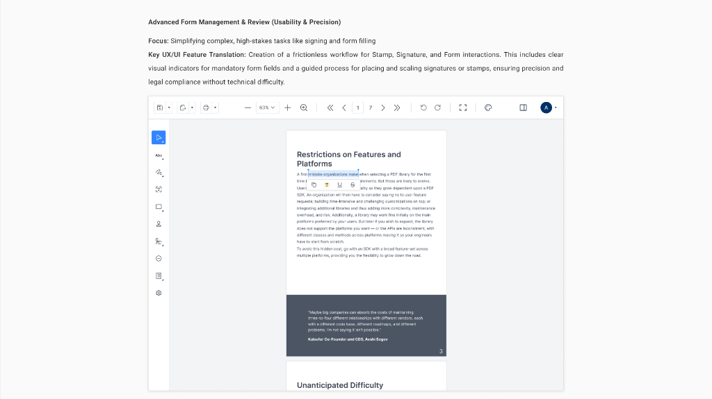
Focus: Simplifying complex, high-stakes tasks like signing and form
filling.
Key UX/UI Feature Translation: Creation of a frictionless workflow for Stamp,
Signature, and Form interactions. This includes clear visual indicators for mandatory form fields
and a guided process for placing and scaling signatures or stamps, ensuring precision and legal
compliance without technical difficulty.